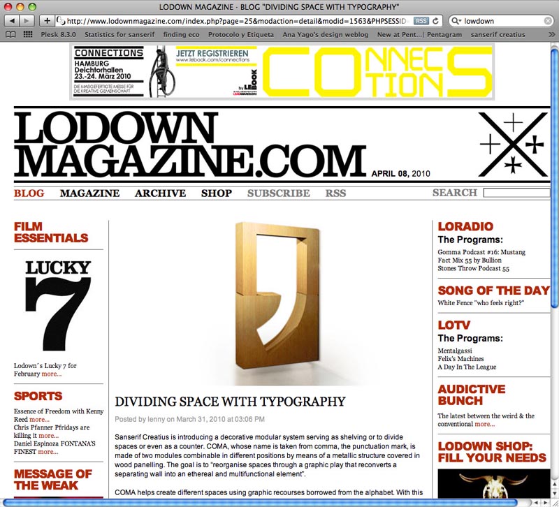
10 Abr Dividing Space with Typography in Lodown Magazine
Dividing Space with Typography, new review about Sanserif Creatius’ work in Lodown Magazine.
Sanserif Creatius is introducing a decorative modular system serving as shelving or to divide spaces or even as a counter. COMA, whose name is taken from comma, the punctuation mark, is made of two modules combinable in different positions by means of a metallic structure covered in wood panelling. The goal is to “reorganise spaces through a graphic play that reconverts a separating wall into an ethereal and multifunctional element”.
Lowdown Magazine · 05/04/2010
COMA helps create different spaces using graphic recourses borrowed from the alphabet. With this in mind, and similarly to the way in which punctuation marks indicate parts of a sentence and structure a text, COMA organises spaces without physically separating them. Furthermore, its modular structure enables it to act as a simple arrangement of space while at once transforming itself into a counter, shelving, a display unit or a container, among other possibilities.
The piece is anchored to the wall. “It is like a branch emerging from the bricks and cement and bringing light and depth into the space”. It projects over the floor, “setting in place an evocative visual game with a lightweight volume, replacing the concept of the dividing wall with a structural element added to the construction”.


